Sunday, June 3, 2012

Painting 7 and 9 at Long Last


     Hey there! Yep, it’s been a while again.  Only 2 entries in May, ouch!  The bad news is it seems pretty unlikely that I’m going to get to my goal of 26 paintings in the time I have left.  The good news is that I have still been painting even though you haven’t heard from me in a little while and I have some new stuff to show you.  The even better news is that I have a show coming up! I belong to the River Town Artist’s Guild here in Grand Rapids and they had been looking for someone to show at the Wyoming branch of the Kent District Library (where I first found out about the River Town artists). I said “Hey, that’s perfect, The Intiative will be over by then and I’ll have 26 new pieces to hang so let’s do it!” Showing at a library doesn’t sound all that glamorous, but it’s actually a nice little gallery they have just outside of  the main community room in the library.  
     I have a little bit of an extension since I won’t need to hang anything until July 7th and the stuff will be hanging for over a month, so you local folks will have plenty of time if you want to come and check it out.  I committed to 26 pieces because at the time I was still under the illusion that I might actually hit my goal for The Initiative.  As it stands I’m just going to work as hard as I can and fill the rest in from my earlier pieces from before the initiative.  


Might have to go back a little further to fill out a full 26


What I really need are frames!  Shockingly, the guild doesn’t want to be represented by pieces of paper masking taped to the wall like the hallway of an elementary school. So if you’re reading this and you have a way of getting a 12x16 or 11x14 frame to me here in Grand Rapids, I would be super grateful.  I will even give it back when I’m since I don’t really know where I will store 26 framed artworks in my apartment anyway. 
     Today is day 54 of The Initiative and I have 9 paintings done, that’s 6 days per painting. 3 days per painting was my goal…I have literally gone half the speed I set out to go! *Sigh*… I’m not going  to dwell on the negative. 
     So, now that I’ve admitted to myself that I’m going to fall short of the goal I set in March, it’s time to reassess.  I’m not going to roll over and say “Okay, I’ve got 25 days left so I’ll plod along at 6 days a painting, paint …(Making heavy use of my calculator right now, reminding you I’m an artist, not a mathmologist) 4 and 4/25’s of a painting and call it quits June 26th”.  In case you remember, that’s another thing, I originally said the 27th but I counted wrong  (I can hear my 2nd grade teacher laughing her dirty bitch’s mouth off to see that I still can’t count to 79). 

But no, I’m going to buckle down and see what I can get done.  My new goal is July 7th (remind me to make the last few projects watercolour so I’m not hanging wet oil paintings at the library) and even after that I’m not going to call this Initiative complete until I have the 26 pieces I promised you all.  This project was about painting, and having having finished pieces, and learning some things about myself.  The time limit was just to light a fire under my butt so I didn’t just coast and finish the last piece sometime during the second term of the Bieber administration.  (For those of you not following, I’m hypothesizing that some time after has ridden out his musical success, Justin Bieber will roll his popularity into bettering the world through politics.  After a strong career as governor of ….let’s say Nevada, he’ll run for president and the country will love him so much they’ll repeal the law restricting a born Canadian from being president (It’ll be the 2040’s we’ll be so much more progressive by then) Justin will be elected, do a bang-up job and then be re-elected for a second term, during which I would hypothetically complete my 26th painting.  You couldn’t put that together? Seriously?).   So sit down and strap in because this ride still ain’t over.

You said it Bieber Nixon!
      I am cooking something else up for after my 26th painting is done. Turns out this “having goals and being accountable” thing, while it hasn’t yielded the results I was looking for, has still given me more completed works than I have had in any 3 years combined since college. But more on that in a later post. On to the art at hand!
     For those keeping count at home, you may have noticed that the last entry said #8 but you hadn't actually seen #7 yet (God bless you if you actually pay that close attention to my silly little blog) but that was a clever trick I played on you because I had finished a painting that I didn't want to talk about yet because it was going to be a gift for one of my most loyal followers: my Mommy.  Mother's day happened in that time and I didn't want to ruin the surprise because my painting turned out far better than I had hoped and I knew that Mom would be on here checking it and these things just never look as great on here as tehy do in real life so I wanted the first time she saw it to be in person.  I did a portrait of my Mom's Mom who passed away a few years back after valiant battle with emphisema.  My Grandma was an awesome lady.  

     She always managed to be this classic, tough, southern woman who grew up on a farm and wouldn't take crap from anyone, but at the same time this really sweet, silly, disarming charmer too.  I won't bore you with all my fond memories of our time together since it won't mean much to people outside my family, but suffice it to say that when you think of grandparents and what they're supposed to bring to a young person's life, I consider myself the luckiest guy around that I ended up with she and my grandpa and I wouldn't have traded them for anything.   I didn't actually document a lot of the process here because this painting was on of those agrevating projects where it looks like hell right up until the last half hour or so and then out of the blue starts looking good.  I usually listen to movies while I work and to make sure my mind was in the right place for this piece I listened to a combination of Oh Brother Where Art Thou, The Majestic, and Divine Secrets of the Yaya Sisterhood.  There are probably movies out there that better exemplify Grandma's heritage and what she was all about, but of my personal library, these films have always made me think of her and maybe having part of my mind channeling her is what caused the technical side of my brain to get with it in the final strokes of this painting and really bring it home.

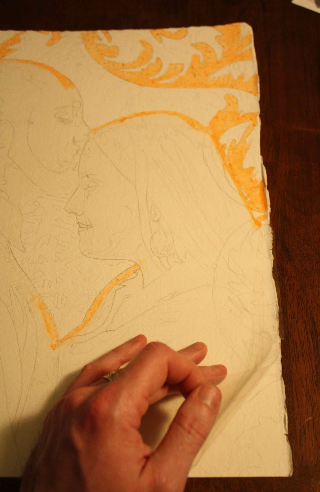
     Since I didn't take any in-process pics for this piece I thought I'd take a second to show you something else I worked on in our time apart.  I was disappointed by the quality of some of my earlier photos.  I have been using my wife's fancy digital SLR camera and I'm not a total dummy when it comes to how the thing works so the only other obvious variable is the lighting.  I have some experience photographing my work and I know the basic principles of lighting:


Right?

     When I used the photo studio at the college the lights had those big cloth bags over the them to diffuse the light and make it more even.  Now, I can't even for afford frames for my own art show, so I'm not about to go and buy pro photography equipment, but I'll sure as heck try to poor-man rig my way through it!

Using 2 types of hangers and some scraps of cloth I had from another project, I built these silly-looking light screens and put dimmers on both my lights so I could get a good, even light on these paintings and it worked out pretty good!  Just to show off, I took the pictures after I framed this piece. (thank you Michael's 40% off coupon!)   Do you see any reflections of me or the room I was taking the picture in? Me neither, my poverty lighting rig works great!   
My ninth painting is an abstract watercolour.  

I didn't have a plan going into this one at all.  I tried really hard to sort of meditate and make my mind totally blank and then closed my eyes and let the first shapes form in my minds eye and this is what I saw. I've always liked the edges and texture that watercolor can create so that was the only thing I was really trying achieve here. Then  I accented it with deep black ink.  I didn't have anything I was trying to say with this piece, I wanted the upper right and lower left corners juxtaposed so one has heavy white lines and the other has thin black lines.  Looking at it now I feel like its a political piece.  The thin black is conservative and the thick white that are looser and wilder could be liberal and the organic blob could be me since I'd be found right about there in the spectrum. The whole thing looks a little like a flag for a country that doesn't exist yet.  See how I can hang significance and meaning onto something that I've already admitted had none when I made it?  This is what got me such great grades in art school.  That's a joke, I'm only sort of that phony in real life.  So tune in later this week and I'll B.S. you some more!  


Tuesday, May 15, 2012

#8 The Insubordinate Tree

     Alright, I am crazy behind. I can't be flexible with my time line or I'm not gonna finish in 79 days like promised.  I also can't just not have a schedule because I need the pressure to keep me on task. The only thing I can think to do is just redo the schedule, repost and refocus.  So I'll figure that out for next post, but first I want to talk about my most recent piece. 

     The original description for his piece said "Tree of Life" it was a concept that has been rattling around in my head for a while. Just trying to capture light filtering through the branches of a broad, majestic tree.  I put this one off for a little bit because I really didn't know how the heck I was gonna pull this one off.

     I just did a little thumbnail sketch on a break at work, no reference photos or overthinking, and then when I got home I just went for it.  I laid in an acrylic sunset kind of background with these liquid acrylics I have.  They behave a lot like watercolour except that when you're working  on a gessoed surface they don't life back off when they're dry like watercolour does, which makes them totally ideal for what I'm doing here.  When I went back to wet my brush, I slopped some water onto the not-quite-dry surface and when it pooled it lifted the color and left a really cool splotch.  When I'm at a loss with what to do in a project, I look for little happy accidents like this as a guide, so I proceeded to speckle the whole surface with water and came back with a nice surface that really had some character.  I'll go ahead and take a note here because maybe in the future I'll do a piece that stops at this point with the cool, streaky splotchiness, but right now, I have a tree to paint.  I projected my thumbnail up and sketched it in and now I'm ready to tree.

Yep, another case of "stop now 'cuz it's already cool, or go ahead as planned and risk ruining it"            ...Let's risk it!
     So I painted the tree in with a combination of burnt umber and ultra marine (a mixture I got from from one of my newly acquired art books *Thanks Jan and Don!*) purposely so that if it got thin in spots it would still have some color to it without just being a muddy black.  once I got the thing laid all in it really just looked too basic.  I tried to thin the branches where the light was coming strongest from behind to simulate the light obscuring the edges like it did in the UFO Landing and the effect sort of worked, but what I was really drawn to was the softness that I got from overworking those edges
   But I was not about to go through and soften every branch individually so I decided to try a trick that has served me well with watercolour.  I take a little spray bottle and soak the the whole thing down with water (or, since this is oil paint, I used paint thinner) get it just wet enough and the paint runs a little bit and viola! soft bluriness.  Unfortunately, unlike watercolours, the oil paint on gesso didn't have the little capillaries that paper has for the watery paint to soak into and cause the fuzzy effect, so it just kind of sat there and congealed in on itself.  When I looked at the smaller branches at the tips, I noticed something cool was happening.  The paint was running along the branches and running out the end, my tree was growing! So I just expanded on that.  I sprayed portions of the branches down and then held the painting upside down to allow gravity to make the paint run even more drastically.  When it got to where I wanted it, I laid the painting back down and hit it with a hair dryer to keep it from running any further.
Whoa there buster, you stay put
       I repeated this step with 7 different angles so that my painted branches would run in all directions from the center like it would in nature.  Then I sprayed down the trunk.  Every time I sprayed it down the paint would retreat further on itself and make this really awesome tar-like effect.  Lastly I just went through with a rag and cleaned up the areas where the paint really ran out of control.  In this process, The tail of the rag was hanging out of the back of my hand and while I was carefully using my fingertip in the rag to do surgery on the branches, the other end of the rag was dragging all over the trunk in the overly runny paint and making a God awful mess!  Since I have been rolling with whatever came my way so far, I saw no reason to stop now.  I tidied up a few unwanted blobs, but mostly just left it and I got my thin paint coloring effect that I had given up hope on an hour ago so it worked out really great!

So it's more Tree of Death than Tree of Life now, but whats in a name anyway right?
Dislikes: Now that it's a tree of death, the background coloring seems too bright and shiny now.  If I were in an art school critique, I would say that the juxtaposition makes it more interesting but that's just B.S. to cover the fact that I didn't plan like 85% of how this painting went.

Likes: That like 85% of this thing did whatever the heck it wanted and I just rolled with it until cool stuff happened, you gotta love when that happens.  I learned from this piece that taking my hands off the wheel now and then has it's rewards...in a metaphorical sense. When actually driving, always keep your hands at 10 and 2 kids, 10 and 2. 

Sunday, May 6, 2012

Hello Old Friend

I know, I know, It's been WAY too long since you've heard from me, over a week! Obviously this is unacceptable and I know it.  But there was ...an emergency?  Yes. Yes, an ART emergency.  See, my building was on fire and all the fire hydrants were in use due to another giant water slide they put up in Grand Rapids so I had to paint the water and then it magically became real like that episode of 1985's Amazing Stories (the one with the wheel on the B-52 bomber?) and so I had to paint and paint for days to make water but the flames. Just...um.  Ok, that's not true. Well, the water slide part was, astoundingly, sort of true.
      The real art emergency was ArtPrize venue matching starting without me.  I had to throw together some sort of presentation to convince a venue to allow me to hang my work and that kind of hogged up a bunch of my time for a few days.  Still waiting to hear back on that.  15 requested venues, 2 have declined, 13 are still thinking, they have, like 3 more weeks to mull it over. the waiting is aggravating!
        Anyway, enough excuses.  I have been working and I went WAY over on my allotted time but I think that just this once it was worth it.  I am prepared to scramble my butt off to catch back up on the TWO paintings I am already supposed to have DONE in order to have this painting that I am so proud of.  Toward the end of this one I was really able to pick up some speed too.

I laid in the background with acrylic again since that dries a heck of a lot faster so that I can get to putting in my foreground sooner.
The thumbnail of this looks a lot like a Bob Marley T-shirt I saw a guy wearing one time with some kind of big leaf on it

    Then I moved on to laying in the tree trunks.  The reference I used said these were sequoias, but they look like birches to me.  I chose these because they are definitely trees but I could get some good texture into them without having to paint every little chunk of a rough bark like an ash tree might have and then go through the trouble of trying to miniaturize that texture at an even rate as I went up the tree.  If you put a lot of effort into being lazy, does it still count as being lazy? The world may never know...    
     I tried to stay pretty true to the local color from my reference photo but I really wanted to punch up the contrast between the violet trunks and the green leaves.   
       When I say that I was able to put on a little speed toward the end of this painting, I noticed because the first 3 tree trunks took an hour a piece to paint, but I was only 2 hours finishing the last 4.  Moving twice as fast is pretty good.  It does kind of go without saying that I got into a groove painting the same things over and over and by #4 I definitely had my color mixtures figured out, so that saved some time too, but I like to think that I was moving with a little more confidence and painting more boldly. I feel like I'm finally getting some of my painting chops back.  The best part is, there is no marked improvement between the 1st and last trunk I did.  I hate that when the first or last of any repeated object in a painting looks different because I either A: figured out how to really paint it right by the last one, or B: started getting sick of repeating and totally phoned in the last couple.  I know that I have a tendency to do this so I try to complete repeating objects in a random order so it's not so easy for the viewer to see a steady progression/regression in quality as they look.  I did do these trunks randomly, but I don't think it was necessary since it's not too obvious where I stopped and started...I don't think.  Care to venture a guess? C'mon, it'll be fun!

     I don't have a whole lot else to say.  This is going to have to be a short entry because I have a lot of catching up to do.  So, Without Further Ado, here's the final product:


Dislikes: It took forever to finish, the acrylic leaves looked more realistic before I added the light coming through from behind, and I didn't measure my board before I started so now I have to try to cut an inch off this thing without ruining it, before I can frame it. 

Likes: My punched up color turned out exactly as I intended.  I am happy that I spent the extra time.  This is probably my favorite piece since the initiative began.  

Friday, April 27, 2012

The Amendment Period


It’s Amendment Time! 


I built this little safety net into the Initiative so that if it turned out to be a complete disaster (see sunflower calamity for definition of “disaster”) or just wasn’t working, I could make some tweaks to the program so that it didn’t make me want to eat my fist every time I thought about the (pauses to do math…..) 64 days I had left once I got to through the 5th painting …which was supposed to have been like 3 days ago.  Which brings me to my next point, I need to do something about my time scheduling for this deal.
     Don’t freak out, I’m not backing out of my plan of 26 paintings in 79 days. I’ll still adhere to that, I just need to tune in the schedule a little. Another thing I failed to take into account is the time it takes to write this blog! I could just toss some pictures in throw in some “here it is” captions, but I want to give it a little something extra.  I’m not a writer by any stretch, just look at the poor structure of all my run-on sentences, but I try to give a little how-to and maybe a little humor as a reward for folks who come here and really get the whole story instead of just glancing the facebook link.

     On that subject, I’d like to say: “Thanks so freakin’ much!” to those of you who come here and read because I know I’ve been getting visits, I saw it on my analytics page, but there are no signs of anybody! Please, pretty please, leave a comment at the bottom of a post that you like.

I know I’m needy but do me a solid and let me know there are friendly eyes perusing this thing now and again, it just takes a second. You don’t have to be a member or anything, you don’t even have to leave a name.  Just a quick “cool” or “I liked it when you did the stuff with all of the things.” I’m being insecure as heck, I know, but its lonely here on the interwebs without you guys!  
   
     OK, done whining. My plan of every three days was a little oversimplified.  I’ll keep the schedule and let you know when I’m going to do what paintings from my list of works, but I need to come up with a better formula to make sure I have lots to do on the weekends when I have time and little to do on other days like Wednesday where I don’t have a free second till around 8:30pm. A painting due on Wednesday is a guarantee that I will be up late finishing and that, in the long run is not sustainable since I become a lazy grumpy-pants if I don’t get enough rest.  You can say it, I sound 80 years old, but it’s the God’s honest truth.  My hope is to set up a schedule page somewhere and link it so its easier to check on than rooting through posts for the “art to do list” one.  Then I’ll update that every week on Sunday so I can be a little more flexible with it.
     In my short 2 weeks of this plan, I’ve learned something.  It’s not all laziness that has kept me from doing my work all these years. Having a full-time job, a wife, pets, stuff around the house to do (we’re talking picking up my shoes and doing dishes every 3 or 4 days, I don’t wanna make it sound like more than it is)  and regular grown-up life stuff like errands and such , I genuinely don’t have a ton of time in my life for art.  Don’t get me wrong, I pretty handily will choose to take care of some of this other stuff over the art by telling myself its more important at the moment thus, avoiding my work that way, but I don’t think I’ve been sitting on my rear watching TV with every hour I should have been painting and that makes me feel a little less like a failure that I’ve let this part of my life slip so far.  That’s all I get out this epiphany though.  It’s actually harder to work in painting around all this stuff that needs to be done instead of choosing to watch Office reruns for the next 4 hours or paint like I thought was my problem.

Oh Jim, you Rascal. 


  But giving art this little bit of importance, enough to make a promise to myself has shown me that I can do it, I just need to learn to tap dance a little better so that there is a balance.

     Moving on, I’m going to leave the 4 hour time limit in so that it’s always in the back of my mind to move it along, but in practice I’m going to treat it as more of a guideline.


the 4 hour rule is more what you'd call "guidelines" than actual rules 

 
   I’d rather go over on my self-imposed time limit that rush it and turn out art that I’m ashamed to show to people (again, see link).

Everything else is working great.  I fall behind pretty easily which we all knew was going to happen, but hopefully, with a little more scheduling magic and a teaspoon more drive, I can get back on track.

Thanks again. Stay tuned for some naturey oil painting of trees…it’s gonna be a lot cooler than it sounds I promise.


Thursday, April 26, 2012

#5 The Sun Flower Calamity

It was all going to be so perfect.  you just never know when catastrophe will befall you...you just don't know...Ok, catastrophe might be is definitely overstating.

      I set this project as my fifth because it was supposed to be one of the easiest paintings to finish.  I already did much of the work for this one back in 2005.  It was supposed to be a gift but I never finished it to give to the person...for personal reasons. The idea was pretty basic but a little outside of my style.  I refer to it as my "paper craft" piece because it was just a couple of sunflowers but I drew the heads separately and then meticulously tore them out leaving a cool, ragged edge that I knew would absorb the paint differently and give a cool effect.


It looks so innocent to turn around and cause me a bunch of trouble...lousy paper flower.

So when I found this piece with the prep work and tearing already done I though eureka! This will be a nice gimme to throw myself in a pinch and finishing what you start is good for the soul...

     Take, for instance, last night, I started eating a bag of Oreos and I had to finish the whole thing because hey, I started it and I don't want my soul to atrophy or somethin' right?... See, 'cuz I started it..and ...Ok, now that the amateur stand-up comedy portion of this post is over, we can move on:

     So I have this piece and I figure it will be a great one to make my #5 just in case I'm feeling overwhelmed I can take it easy with this one.  This could not have been more wrong. 

    As I began masking off the background with liquid frisket, I made one good stroke and as the wet frisket began to bubble a little more than usual I had a horrible flashback of a project years ago.  I had spent tireless hours masking and when I went to remove the frisket material, it had soaked into the paper instead of staying on top so the only way to pull it up was to tear the first layer of paper off.
     In a panic, I immediately dried the first little bit and tried to pull it up and lo and behold:

*RIIIIP*

As you can plainly see, this makes an inconsistent, boogery surface to try and watercolour on.  So let this be a lesson: no matter how sure you are, or how many times you've done it, still exercise regular old caution when you work.  If I had tried a sample out on the edge of my paper before adding it right to my painting surface like a moron, I could have saved myself a mess of trouble.  This little hiccup is only the beginning.

     I'll take a moment here to apologize that there aren't more pictures of this process, but as you'll read ahead, I had to work at a pretty frantic pace to make the rest happen, not a lot of photo breaks

    Now, I was not about to just hang this painting up and start from scratch.  Learning to convincingly say "I meant to do that" is one of the most important things an artist learn. So I decided to just fill the whole background area with the frisket so that when I go through and remove it, at least it would be consistent.  This is a "paper craft" piece, would it be so bad if some paper texture showed a little more? heck no, I might even have stumbled onto something awesome.
     It wasn't until I laid my first brush stroke down (again, on the stinkin' painting surface like an idiot!) that I realized the rest of the problem.  This paper (I didn't realize at the time of course) is Rives BFK rag paper.  Amazing paper for printmaking and pencil, chalk, pastel, DRY media.  When you put something wet on it, it just sucks it up, there's no sizing on the paper to keep paint in the upper layers like watercolour paper has. So my paint just got absorbed and didn't spread or move in any way. In order for my painting to not look like a deranged kindergartener with magic markers made this, I had to work fast and watery, spreading the paint as soon as it hit the paper.  It was stressful having to work like this and I just did my best to get even color, any gradients or subtleties bedamned.
     When I rubbed all the frisket off I washed the boogery area appropriately with a few green washes and it turned out ok.

Should probably have glued this one down too. Warpy-warpy
     for the flower heads I wanted to find a different solution since they would be the focal points, so I got out some luma dyes that I had.  The dye behaves similar to watercolour paint but the colors are usually a little more vibrant due to the higher concentration of pigment.  What better for flowers than something that's vibrant? I was also banking on this higher concentration giving me a little better results with the soaking issue the watercolour was giving me.  All in all the dyes did give me better results and maybe someday I might try them with this paper from the beginning instead of rolling them out as a colorful band-aid for a failing painting. I glue the heads onto the flowers with my PH neutral glue and this disaster is finally over.


 Likes: I do think the Luma dye gives a cool effect, especially in the brown parts on the inside of the head.  The Paper textures and effects of tearing out the heads worked out exactly as I planned too, if only the painting was up to snuff.

Dislikes: this subject matter and the paper technique were both things outside of my comfort zone.  The only reason I even attempted it was because I thought the person it was originally for would like it.  That said, If so much else hadn't gone wrong I would have viewed this experience as a positive one.  I guess we learn more from our failures than our successes so I gained some knowledge, but I don' t think I'll include this piece in my portfolio of my finest work! 

  NEXT UP: More nature & back to oil paint!


Monday, April 23, 2012

My Buddy's Dad Portrait

Gonna get a little more serious on you for a minute.  A good friends' Dad is having a rough go of it right now and I thought I would make him the subject my next portrait.  Truthfully, I don't know the guy, we've met, but never really talked.  I do know his daughter is a great friend to my wife and so I thought I'd give the painting to her when I'm done.
     I'm using plate bristol paper this time.  It's pretty much the polar opposite of the stuff I've been using.  Instead of a rough, grainy surface, it has a smooth almost shiny surface that allows the paint to sit on the surface a bit more instead of soaking in. This creates some really random and cool painterly effects.
     Since it worked so well on the last painting, I'm gluing this paper to a board also.  This time I'll take extra care to make sure the edges are glued down to prevent them from curling up like the last one did.    
     I thought I'd use watercolour pencils to layout the drawing since this paper will show the underlying pencil lines a bit more prominently than the rough paper I've used for the other 2 watercolours. 

     I've used a kind of scribbley style here. I'd say it's the pencil equivalent of scumbling in painting.  I spritzed the whole thing down with a water bottle to see how far I could get the paint to run on its own. Turns out, not that far. I'm going for a really minimalist approach with color and saturation.  I won't get heavier than a few light washes to give the portrait an airy quality. I'll just layer up watery paint and let the paint do what it's going to do.  My second grade teacher would probably scold me here because I'm not at all concerned about staying inside the lines.(She was a dirty B**** anyway, so I'm not too worried about it)  I layer in his facial features and the only place I want to get a detailed, saturated look is the eyes.  In my experience, if I leave the eyes a light, sweeping impression like the rest of the piece, its really easy for them to look dull and flat. So, to take special care I'll dab just a but of white gouche in for the reflections on the eyeballs and work in a gradient near the pupil to give a little more depth.

...with a few of my trademark splatters thrown in (literally) for fun.

Likes: I can't get enough of really watery watercolour. That's what I love about the medium, you just fill in color and it does what it wants.  Things like the left shoulder of his jacket or his wife in the background, the patterns, the way the mixed colors separate out a little as it dries.  The medium seems to breathe in its own way like nothing else I've used including any digital stuff.

Dislikes: Not a lot.  When I use the paint this way I feel a little more like a collaborator with the paint and it lifts some of the burden and pressure I put on myself to make it look just right.  I always want more life in my portraits than I can currently achieve but it's an ongoing goal.  I guess I would have liked to try harder to include more tones in the skin outside the crayola box skin tones I put together here.  That's it though!


Sunday, April 22, 2012

The UFO Has Landed!

     I've been teasing this for the past week so hopefully your interest is piqued.  One fall night back in 2004 we had the thickest fog I have ever seen.  visibility was lower than it is in some snow storms and every street light and headlight was turned into a disembodied glowing orb.  If there was a night it would be safe for aliens to fly around unnoticed it was that night.
     Despite the extreme eeriness of the night air and the danger of being hit by a car that wouldn't be able to see me until I was 2 feet in front of them, I grabbed my camera and tripod and tried to capture this weird phenomenon.  Despite playing with different exposures and aperture settings (my photo skills are limited to the one intro class I had in college) I wasn't able to get the hazy thick quality of the lights filtering through the fog. Upon reviewing my shots from that night I did discover that something else cool happened.  The light carried out through the fog a lot farther than normal when I left the shutter onthe camera open and almost every shot looked like a UFO landing.


I chose the coolest, most UFO-y one and I'm going to try to recreate the eeriness in a watercolour.  I'm purposely choosing to use watercolour over oil because it will be more difficult to make this light effect work with watercolour where I have to start white and add darks as I go instead of painting all the trees and be able to add in the light and haze afterward like I would do with oil.  I want to have a luminous quality to my watercolour, so maybe this exercise will help me achieve that.

I start by artographing this photo just like the last two paintings but since I had such success mapping out my lights and darks in my last painting, I will try something similar when I artograph this one.  My plan is to work this painting in three basic layers.  The back layer, closest to or even the light which will only be a few shades darker than the background, the middle layer and the foreground which will be the darkest objects in the painting. I'll plan these out in advance by using three different colored pencils that vary in darkness, yellow, orange, red.

I hate it when I layout a drawing or painting and it turns out cool enough to hang on the wall at that step, one of these times I'll learn to just call it done and start another one to ruin by completing it!


  I began laying in the lightest layer and then going over all of that with the darker layer and building from there. 

Yet another step that looked really cool if I'd have been smart enough to stop here. Oh well.
     I added some dark washes to the outside to frame the "landing sight" and then laid in the foreground tree and foliage.  I found that the variance between the dark orange I used for the middle layer and black I was using for the foreground so I darkened up the middle layer.  The definition of the black was too clear also, so I spritzed the whole thing down with a fine mist of water from a spray bottle and let the paint run in whatever direction it liked.

OK, definitely stopping here...seriously, it's done now...for real.
 I trimmed the branches on the right side of that front tree because, to be honest, I lost track of my layout lines and wasn't confident I could make it look right.  Once I got looking at it, I think the composition works a little better than if I'd left them in.


Dislikes: I really feel like this is missing something.  (and not just those branches I left out) I planned to simplify the scene and not include every little weed, but I think my 3 layer approach may have over simplified it.  I may have gotten a better depth of field with a little more variation in color and worked a little harder to blur the lines and contrast toward the back and keep it sharper in the foreground.

 Likes: As a stand-alone painting I think it works pretty well.  If I wasn't so enamored with the original photo and built it up in my head for 8 years I probably would feel better at my attempt.


They'll Call Me a Genius! (if this works)


      I was all fired up to start painting #3 but then I found that I'm all out of my heavy watercolour paper.  I always use the rough heavyweight paper because of the nice texture and variances the in flow of the paint when I just let it go where it wants.  The weight of the paper doesn't mean a whole lot to me except that when I really make the paper wet, the lighter stuff warps all up to the point where, if I don't watch it, it will create pools of paint that results higher concentration of color where I don't want it.  I have several pads of watercolour paper that has teh texture I like put is thin, so has the potential to warp.  What I'm going attempt to do is back this cheaper paper with the masonite boards I was going to use for oil paint.  The masonite is 8 bucks for a 4'x8' sheet so if this works I'll have an inexpensive way to make my cheap paper more stable than the expensive stuff, it'll be win-win!  

I start by cutting my masonite down to a size just slightly larger than my paper, this time I'm using Strathmore Lanaquarelle 140lb cold press, slightly smoother than "rough", but not as smooth as hot press.


Next, I put some glue on the board.  I know it looks like regular elmer's but its actually an achival acid neutral glue.  I don't want to just use any old glue, I know just about anything will do the job of sticking my paper down, but since this is something I hope will adorn somebody's wall long after I'm gone, I need to take special care to use something thats not going to eventually break down of yellow the paper.  Purists may tell me that the binding agents in the masonite will do jsut that, but I'm hoping the fancy glue will act as a barrier against that. I use an old cut-up credit with notches in it to spread the glue (waste not want not)

 I flip the back of the paper onto the board and before I rub it down with my hands I place a couple pieces of printer paper on top. Not only will this keep the crud from my hands from getting on my painting surface, but if there is a little glue squeeze-out at the edges and I smear my hand all over this thing, there's a good chance I'll get glue on my painting surface. Right now it won't seem like  a big deal since the glue will dry clear, the paint in that spot won't absorb right and be a real bummer when I go to paint. 

 I grab a bunch of my heavy reference books to press this thing together while it dries overnight.


 Well, it looks solid enough, I guess I won't know how effective it is until I'm in the middle of painting this thing, I hope I don't live to regret trying this. Like, if say, it causes me to have to totally repaint the whole thing because of some unforseen issue. Wish me luck!


Wednesday, April 18, 2012

How Do I Unlock My Inner Murray

Just a little sidebar while I prep for the upcoming alien invasion.
     Part of my day job is to time people in my plant while they assemble the products that we sell in order to find the precise amount of time we take to perform certain tasks.  It is...riveting to say the least and the operators I observe, despite my explaining otherwise, all seem to assume that I am up to something sinister.  
     The other day I was timing a guy, we'll call him Murray (because he sort of looks like a Murray even though that's not his name. I feel like if you picture a guy named Murray, that'll be dead-on to the guy I'm talking about) and this guy was, to put it mildly: haulin' ass.  I try to tell everybody to just go at their normal pace because if they hurry and work fast (out of some fear that I'll find their performance unsatisfactory, I guess) then it throws off the whole thing because it will be unreasonable for us to expect that break-neck pace all day every day.  So I ask Murray to cool it and he tells me this is his normal speed.  That he assembles 140 parts a day.  Now, I know next to nothing about the process Murray's working on, I'm just an idiot with a stopwatch.
      So I ask "Um, is that good?" and he says with a proud half smirk "I'm the only one here that can do 140 a day." Watching him I can see why, all his movements are quick and to the point, almost bird-like and he works to build these parts like his pants are on fire or something.  I ask around and Murray is renowned around the plant as one of the hardest workers and he really does cook like that for nine hours a day, five days a week. We do have a bonus program but nobody else works this hard to achieve it.  I know that Murray can't be taking home as much as 98% of the people who sit in front of computers doing cushy white collar work all day.  So what drives him?  I asked directly and he told me when he gets down to something, he just wants to get it done, he's always been this way.
AAAHH! NO! PUT THAT FIRE EXTINGUISHER DOWN AND HAND ME THOSE PARTS, THERE'S WORK TO DO!
     I simply don't understand people like Murray.  Its awful to say, but I can't think of a time that I was as driven as he is every day.  My whole life I've had to be coaxed or rewarded into doing things.  I have moved like Murray before, don't get me wrong, but it was usually because I loafed around until the last second and had to scramble like crazy to catch up and that is, very much, not the same thing.
     I take pride in a job well done and I do work hard when there is a payoff, but pretty much the whole time I'm working I can't wait for the job to be done and to get that payoff.  The things that interest me at work are innovations, things I can do to make my job easier. I have no interest in rolling up my sleeves and powering through for years on end, I'd rather think my way out of it. I do realize though, that if I had my innovation and Murray's work ethic I would be unstoppable. So what is it that Murray has that I lack? Well, a work ethic obviously, but I mean deeper down.  Is there a way for a couch potato to become a Murray? These are questions I hope to try and answer over these coming weeks of The Initiative.  I know some of you are saying "A painting every 3 days? That's kid stuff" (I'm lookin' at you Comfort and Adam) but this is hard work for me and I'm hoping it will teach me something about myself that I can use to, at least, start unburying my inner Murray.

Tuesday, April 17, 2012

Running Late, Naturally

Yeah, yeah,  I know
     So I am officially an entire painting behind schedule!!!  I'm not going to let it make me crazy.  I knew there was going to be some adjustment needed. I haven't tried to fit this much art time into my life since college and I wasn't working around a full time job then. This was always going to take some getting used to. Also, I have always sucked at forcasting how long it will take to do things. That's part of the reason I am always late to everything everywhere I go!
Let's see, I hung these up five minutes ago and I have to be wearing one at work in 15 minutes...I'm probably good.

     I will do my best to catch up this weekend and get back on track.  Maybe on amendment day I can give myself more time for the first few projects and dial back the time allowed as I get more used to working faster...No, I committed to 26 paintings in 79 days and I at least have to stick to that much. I'll figure it out.  Incidentally, if  anybody has a suggestion for a solution to this, I am all ears!
     Ok, onto painting number 2.  For this work I chose to take a small item and paint it huge. I work in a truck parts factory and we have all sorts of interesting doodads that fit the bill.  This will also give me something appropriate to hang in my office too! It is my secret hope that one of the upper managers will stop by and really like it and commission me to do one for them, but that might be a pipe dream.  The object I chose is a suspension valve that our company assembles.  This is what it looks like:
I think the actual part number for this thing is DOODAD

     So I cropped this thing out in as cool-looking a way as I could (4 years of art school and my principles of composition are still: "do stuff till it looks cool".)

Got a little premature with filling in the background before layout, that's where the blue streaks came from. Oops!
     Since I was going to cover up my pencil lines with paint, I decided to get a little more detailed and put some shading in so I could more easily tell what was going to need to be dark and what needs to be highlights.


     The first night I stayed on task really well, 2 hours and I kept it nice and loose.

    I finished out what I thought would be the most difficult part in preparation for the standard mid-painting lethargy that always sets in when the thrill of starting a new project wears off and I'm too far away from being done to be excited about that.  I set it up this way so that when I think about going in and working I can trick myself by saying "C'mon Smith, the hard part's all dine, just get in there and finish out." It seemed to work pretty well this time.  Because I was able to put in another 2 and a half hours on monday night to bring me here:

     For those readers who are students of higher math, you might have noticed that 2 plus 2.5 equals 4.5 hrs (a half hour over plan) and the painting still isn't done. Here lies the problem.  The watercolor went over by about 3 hours too.  I just haven't gotten in the right mind set to finish these in the four hours allotted. On this painting especially, the second night I lost focus and started getting tighter and more meticulous.  It looks good, but this wasn't supposed to be a rendering. I am striving for a looser, more painterly approach and I'm slipping into old habits. As I've said,I'm not going to beat myself up over this.  These are the first 2 paintings I've done in a long time and I'm still greasing the joints of my art skills.  I'm not going to wig out unless this continues to be a major problem in the future.
     I wanted to take a second and mention, the awesome thing about oils is that you can leave your palette sitting for a day and come back to it and it will still be mostly moist enough to reuse so you don't have to try and remix and match your colors.


     I set out to learn to mix colors really well so I could save money on paint.  I figured if I could just buy 3 primary pigments, I could mix everything from those.  I have since seen the error of my ways, if you can get a rainbow out of 3 colors than you can get a dozen rainbows worth of color from a full palette of paint tubes.  Something that I still carry with me from Illustration 201 class is always mixing blacks.  I bought a tube of lamp black for quick black and white work but I have never used black paint from a tube in a color illustration. Yet another lesson beaten into my head by painting prof. Jon McDonald is that dark shadows don't have to be these endless mud puddles, if you take the time see what colors are making up the shadow and mix the shadow, it will always look about a hundred times more rich and beautiful. Also, don't trust Whitey. (Just kidding Jon) On a more generic note, if you need black paint that is awesome and you're an inexperienced mixer: an equal mixture of Ultramarine, Alizerin Crimson, and Burnt Umber will kill it every time. 
     Well, I finished up tonight and I've gotta say, even for 6.5 hours, this looks pretty good to me:


Likes: Well, I know from experience that this valve is kind of a dull, black plastic but I really tried to pay close attention to what colors were really reflecting off this thing and how it is a lot more reflective than I would have thought. Any time I can set aside my preconceived notions about a subject and just paint what's there is a win in my book. The screw is my favorite part.  It's the perfect combination of painterly and precise that I'm looking for.  When you're right on top of that big screw head, the shapes don't make any sense but then when you step back you get that "ah-ha!" moment. perfect

Dislikes: The two deifferent styles this ended up in bugs me.  Lucky for me the loose and precise part are made of different materials respectively, so I think I get away with it this time, but I need to pay better attention in the future

NEXT UP: UFO LANDING!

So stay tuned!


Saturday, April 14, 2012

Back Again (just in the nick of time)

     No, not the Johnny Depp film from the late 90's, this a different nick of time. (I remember that movie being pretty good, but after rewatching stuff I liked as a teenager I'm finding more and more that I had really crumby taste in movies as a teenager. Anybody?)   
I walk away from my 1990's style computer for 4 days and the lousy cobs have made their webs all over the thing
     Oh boy, it's been a little while huh? sorry about that, I didn't anticipate doing the artwork would take so much time away from posting.    I don't know why I didn't factor that in...Anyway, things have been a little trickier, this first week, than I had anticipated.  I feel like I spend a LOT of time vegging out in front of the TV or playing on the computer. So I really thought that just cutting that stuff back would leave me plenty of time for art. I think I was oversimplifying the problem a bit.  I get home from work about 5:15 and by the time I chat with my wife about our day, take the dog out, figure something out for dinner and maybe (and this is a big maybe) do some dishes or regular tidying stuff around our place, there's not really a ton of time left. Throw in an errand or any additional projects and it's bedtime! So, during the week is going to be tricksy but I will figure it out.  Maybe I'll need to reorganize my to-do list of art projects from a few posts ago to try and arrange it so the really demanding projects fall over the weekend. I am NOT, however, going to just change the rules.  I set these goals and I WILL follow my rules until the amendment period next week and do my tweaking then.

Enough about my personal whoas, ONTO THE ARTING!

     I said back when I was writing the rules that I was going to need to take extra care to prepare these projects so that I can get the painting part done in the 4 hours I originally allotted myself.  For a while now, I've working with my Dad on and off to build an electric guitar from scratch. Aside from all the little woodworking tricks I'm learning from working so closely with an experienced guy like my Dad, I am also learning that I jump into projects way too fast. I want to get to the good part, lets get dirty, make some sawdust, smear some paint, jump to the gratification part.  At first, it was aggravating to me that Dad wanted to be so planned and measured every step of the way, but now that we're nearly 2 years in and almost to the halfway mark of our guitar project, I can see the value in not just diving in, screwing things up because there was no plan and then spending 50% more time on the project just to fix boo-boos you wouldn't have made if you just took a second to think.  (I almost sound like a real grown-up right now huh?)  So I'm trying to apply that to what I'm doing here.  I've only left myself a short amount of time to paint, so everything needs to be perfect to start.
This is the guitar we're building after 2 years of hard work (we're really being careful to plan it out)


   The part of watercolour that I have cut corners on in the past has been masking things off properly so I can paint parts with absolute abandon and not worrying about mucking up the rest of the painting.  A lot of the time I don't even mask, I just start painting because I have enough control to just stay away from things I don't want to paint yet.  This has worked out just fine and when I'm in mindless paint mode (the same trance I enter where I'm known to drool on my paper or drink my watercolour water) I don't really notice the extra time it takes to be meticulous with layer after layer of paint.  For this project I'm gonna mask the heck out of his thing so I can splash paint all over the kitchen table if I want and still not botch the areas I don't want to paint right away!
     For this operation I am using a masking solution or "liquid frisket". It's essentially a really rubbery rubber cement that is a little more watery in consistency.


The stuff I use dries orange so you can find it later to remove it.  I suppose it still might be tough to use this stuff when painting an orange...guess I'm lucky I'd rather enjoy a nice glass-shard sandwich than do another still life.
  I also will use frisket film for blocking out the big areas, this is a clear film that has adhesive on the back.  It doesn't stick very well to the rough paper I'm using so I go around and seal the edges with the liquid frisket to stick it down.

It's a little hard to see the film in these pictures, but I assure, its there.
     Now I'm all set to paint in the background.  It's a lot of greenery, leaves and fronds, somewhere exotic. Well, I mean, not too exotic, they're both in long sleeves... I don't know. I can rough this in as wet and messy as I want now, knowing that the subjects of my painting are safe from wayward brush strokes.
     The whole masking process was about an hour and a half.  I know you're thinking "Well golly, you don't sound like you're saving time at all" and you're right, but one of the key points of this initiative is to get faster at painting.  If I still need to get faster at prepping when I'm done,  I'll start The PrepFast Initiative in July. Until then, I'm going to take my time so I end up with quality, thought out work. 
     Once I get the background painted in to my liking, It's time to remove the masking.  The Film pulls up easily enough, but the liquid stuff will need to be rubbed away with a rubber cement pickup.  I back that over it a couple times out in the parking lot and viola! Just kidding, a rubber cement pickup is basically a hunk of dried rubber cement that grabs the frisket as you swipe it over it and it balls up and comes off.  Before starting this, I go in and darken some of the more critical lines because the rubber of the pickup will erase them and then all my prep will have been for nothing. I didn't take a picture of this, ( must have gotten too late )
     The next night (thursday) I had to mask the floral pattern at the bottom that will stay paper white and then I painted the shirts in. 
The floral pattern on the sides there will be black, so I don't need to mask them.

      The rest of the painting went pretty well.  I tried to layer the colors instead of just mixing them on my pallet. The groom's ear got away from me a little but I reeled it back in with some white gouche. (really opaque tempera paint) When I finished, I used the pickup again to remove the rest of the frisket (ooh, my aching wrist!)  


Finally captured the elusive "my right hand" in its native environment...simply breathtaking.

...And here is the final piece:


Likes: It looks like the people it's supposed to be (always a plus in a portrait). Graciously, both their eyes are closed, so no chance of "wonky eye syndrome" some of my past subjects have suffered from.  I spattered a few layers of green paint to give it a kind of verdant jungle feel, that turned out well.The careful masking really paid off, the white really pops.


 Dislikes: I'm my biggest critic and there's always something that picks at me about every piece so don't try to convince me otherwise.  I didn't really capture the love from the original.  They don't look like they're sharing a cute forehead kiss in my painting. They look sad, like he's consoling her. "Cousin Matt is coming for a visit, what are we going to do?" "I know honey, be strong"*peck*